Trails first: how the map is drawn for a watch
Five kinds of path, three weights of street and one very large dot. Why the paths on the Maps4Watch map are amber and the roads are grey.
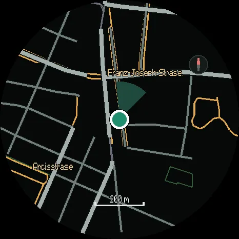
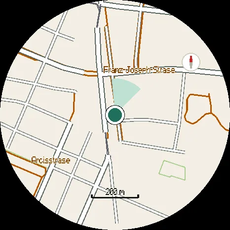
A phone map can afford detail. It has six inches of screen and you are holding it still. A watch map has a circle about the size of a coin, on a wrist that is moving, and about a second of your attention. So Maps4Watch draws less than a phone map does, and draws it thicker.
What you are looking for comes first
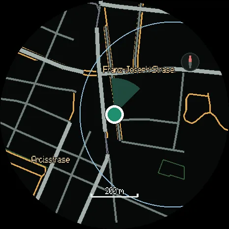
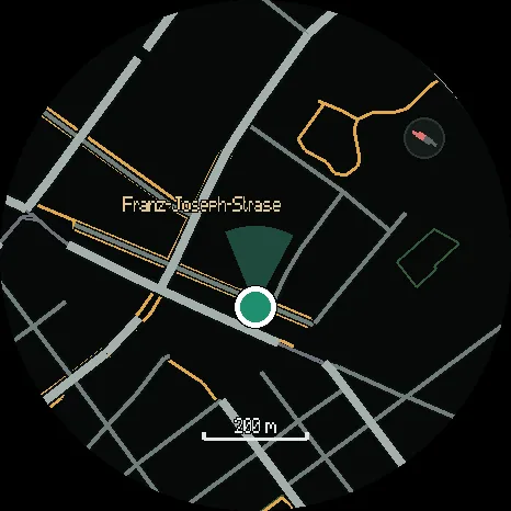
On a run or a walk, the question is rarely which road you are on. It is where the path goes. So paths, trails and steps are drawn in amber, the brightest colour on the map, and streets are drawn in greys that step back.
| Line | Colour on the dark map |
|---|---|
| Footpaths and steps | amber |
| Cycle paths | pale gold |
| Tracks | brown |
| Main streets | the widest, lightest grey |
| Minor streets | mid grey |
| Service roads | thin, dark grey |
Woods, parks and water are tinted areas with a fine edge, so you can tell the park from the street around it without either shouting.
Streets get an edge
Each street is drawn twice: first a little wider in a dark edge colour, then in its own colour on top. Where two streets meet, the edges disappear and the junction reads as one shape. Paths are drawn before the streets, so a street covers the pavement beside it instead of fighting with it.
Names you can read on the move
Every name sits on a halo in the map’s own ground colour, so it stays legible over a street or a river. Places are near white, streets are grey, paths a soft amber, water blue and parks green. The colour tells you what kind of thing is named before you have read the word.
You, in the middle
Your position is a large white dot with a green centre, and a cone shows which way you are facing. When GPS is weak, a ring shows how far off the dot could be. Press and hold the map to turn it heading-up, so the street ahead is up the screen, and hold again for north-up.
Two themes, one map
The dark theme is for the watch display: black costs the screen nothing to show. The day theme turns the same map into warm paper with white streets and dark edges, and deepens the paths to a burnt orange that holds up in direct sun.
Built for your watch, on your phone
The watch does not do this work alone. Your phone builds each piece of map for your watch model, to a strict size for its memory. When a piece is too crowded for a model, the least important things go first, starting with buildings, and the paths go last.
Coming soonto Google Play for your phone and Huawei AppGallery for your watch